

Build a responsive layout using mainly CSS (Grid and Flex)
To skip the tutorial, feel free to download the source code template from my Github repo here.
There are quite a few templates and tutorials out there for building landing pages. However, most tend to overcomplicate or add heavy design (such as multiple pages, forms, etc), to what in most cases requires very simple and lean design. Moreover, I’ll be showing you how to use mainly CSS (Grid and Flex) to create a responsive UI, instead of using old school CSS libraries (such as bootstrap). So let’s get to it! 💪
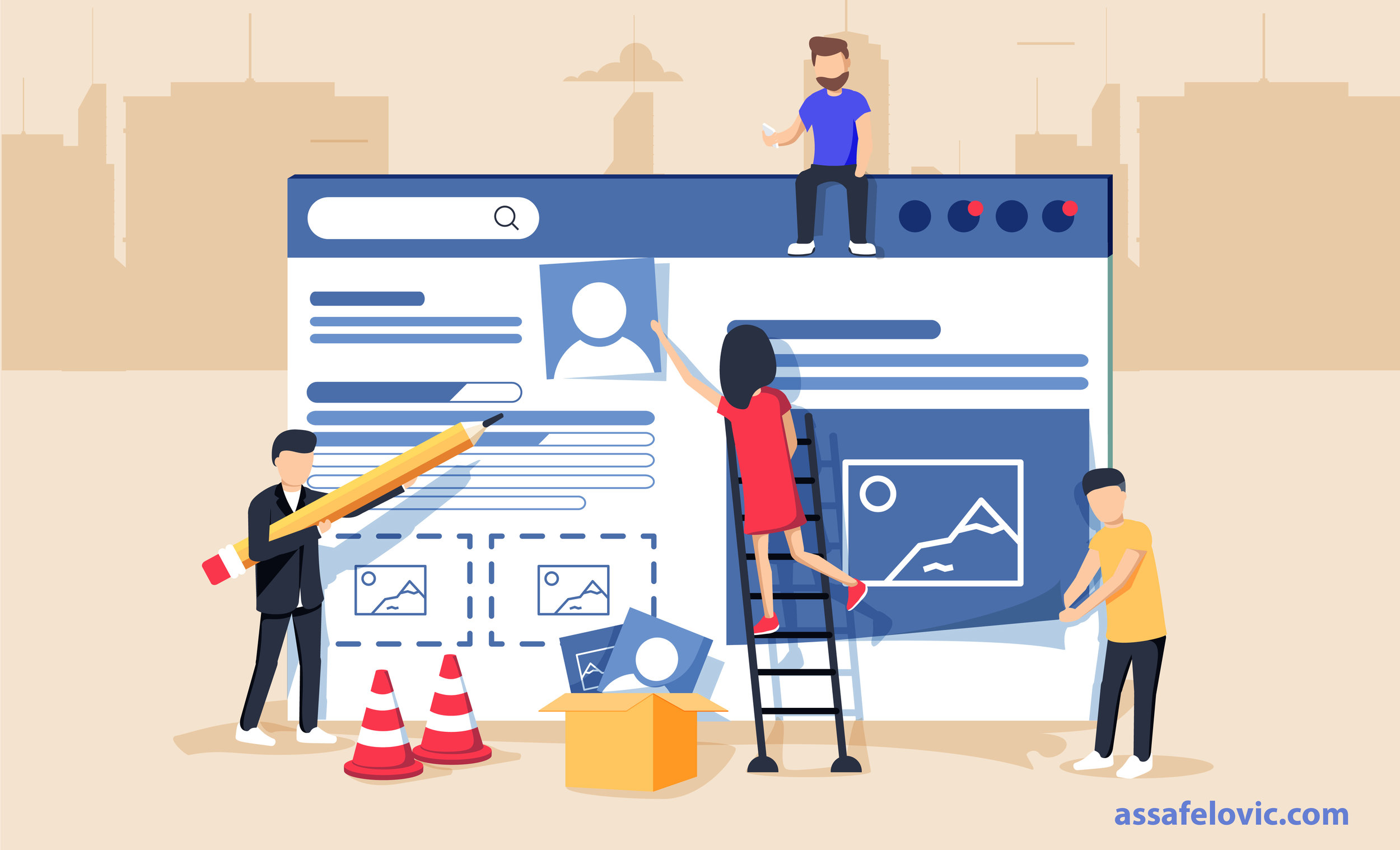
We’re going to build a basic landing page layout, and focus mainly on the fundamentals so you can hopefully take it from there on to the landing page you desire. Here’s an example of the result:

The page will be constructed of four main components: Navigation bar, cover image, a grid of cards and finally the footer.
The index.html is pretty straight forward, which contains mainly div tags and overall page structure:
<html> <head> <title>Basic LP Layout</title> <link rel="stylesheet" type="text/css" href="./style.css"> </head> <body> <nav class="zone blue sticky"> <ul class="main-nav"> <li><a href="">About</a></li> <li><a href="">Products</a></li> <li><a href="">Our Team</a></li> <li class="push"><a href="">Contact</a></li> </ul> </nav> <div class="container"> <img class="cover" src="img/cover.jpg"> <div class="coverText"><h1>Making the world a better place</h1></div> </div> <div class="zone blue grid-wrapper"> <div class="card zone"> <img src="./img/startup1.jpg"> <div class="text"> <h1>Team play</h1> <p>We work together to create impact</p> <button>Learn more</button> </div> </div> <div class="card zone"><img src="./img/startup2.jpg"> <div class="text"> <h1>Strategy</h1> <p>Every goal is part of our strategy</p> <button>Learn more</button> </div> </div> <div class="card zone"><img src="./img/startup3.jpg"> <div class="text"> <h1>Innovation</h1> <p>We're focused on thinking different</p> <button>Learn more</button> </div> </div> </div> <footer class="zone"><p>2019 Assaf Elovic All right reserved. For more articles visit <a href="www.assafelovic.com">www.assafelovic.com</a></p></footer> </div> </body> </html>
Therefore, we’ll focus strictly on the styling (CSS). If you’re new to html and page structure, click hereto learn the basics before moving forward.
Styling layouts with Grid and Flex
Rule of thumb: Use Grid when you need grid-like views such as tables, cards, album media (like in Instagram). In all other use cases consider using Flex. I highly recommend diving deeper into both, since once you master them, you won’t need much else to create beautiful responsive web pages.
Navigation bar
We’ll use flex so we have a one direction row as needed for our navigation bar. Since we’re using a <nav> tag, we want to remove the dots (list-style). Finally, we’d like to remove any default margins set by the browser, so we reset margin: 0.
.main-nav {
    display: flex;
    list-style: none;
    margin: 0;
    font-size: 0.7em;
}
When changing the width size of our browser, we can see some of the nav bar cut out, so we need to modify how it’ll look when the width is smaller:
@media only screen and (max-width: 600px) {
    .main-nav {
        font-size: 0.5em;
        padding: 0;
    }
}
We’d like the ‘Contact’ option to stick to the right so we set margin-left to ‘auto’. This will automatically set a maximum margin to the left of the hyperlink:
.push {
    margin-left: auto;
}
Finally, we’d like the navigation bar to stay sticky and always appear at the top of the page. Also, we’d like it to appear above all other elements (z-index):
.sticky {
  position: fixed;
  z-index: 1;
  top: 0;
  width: 100%;
}
Cover
We use Flex since we want to keep things simple (just center content). After setting our display to flex, justify-content centers content horizontal (X axis) within the container and align-items centers vertical (Y axis). We want the image to fit the entire screen so we set the height to 100vh, which means 100% of view height:
.container {
    height: 100vh;
    display: flex;
    align-items: center;
    justify-content: center;
}
Also, we’d like the cover text to appear above the image and in the center:
.coverText {
    position: absolute;
    left: 50%;
    top: 50%;
    transform: translate(-50%, -50%);
    color: white;
    font-weight: bold;
}
See the full CSS style sheetfor additional minor adjustments.
Grid of cards
As described above, we want to create a grid of cards so we’ll use Grid this time. grid-template-columns sets the style of each column (or div). FYI: If we were to just set 1fr, we would see just one block per column. So we set it to repeat (just like typing 1fr 1fr …) and autofill display with anything from min 350px to whole screen (1fr). Finally, we set the gri-gap (padding between grid objects) to 20px:
.grid-wrapper {
    display: grid;
    grid-template-columns: repeat(auto-fill, minmax(350px, 1fr));
    grid-gap: 10px;
}
Next, we’ll style each cardwithin the grid. The below is pretty straight forward for setting the margin per card and background color:
.card {
    background-color: #444;
    margin: 50px;
}
We’d like each card to have an image fit the entire top area, and under it have a title and paragraph and a button for ‘read more’. Also, we just want to manipulate images, titles and paragraphs within the class card, so we set it with the below:
.card > img {
    max-width: 100%;
    height: auto;
}

.card h1 {
    font-size: 1.5rem;
}

.card p {
    font-size: 1rem;
}
While the image fits 100% of the card’s width, we’d like to add some nice padding to the text area of the card:
.card > .text {
    padding: 0 20px 20px;
}
Finally, we set the button design that appears within each card. We’ll set the border to 0 (since default appears with a border), and add some padding, color, etc:
button {
    cursor: pointer;
    background: gray;
    border: 0;
    font-size: 1rem;
    color: white;
    padding: 10px;
    width: 100%;
}

button:hover {
    background-color: #e0d27b;
}
Footer
Last but not least, our footer is pretty straight forward. We’d like the inner text to be smaller than default, and pad the footer with some color:
footer {
    text-align: center;
    padding: 3px;
    background-color: #30336b;
}

footer p {
    font-size: 1rem;
}
That’s it! Following this simple responsive layout, you can further build almost any landing page your heart desires. To take this layout to the next level with some amazing animation libraries, here are some of my favorites:
Sweet Alert — Add stylish alerts
Typed.js — Add typing animation to your headers.
Auroral — Add animated gradient backgrounds.
Owl Carousel — Add animation to you elements
Animate.css — Add styling animations upon loading elements.
To download the full source code click here!